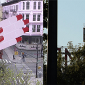
In 1976 Milton Glaser was commissioned by the State of New York to create the “I ❤️ NY” logo, which was adopted by the city as a symbol and immortalized in cool by famous New Yorkers and people who traveled there wearing it on t-shirts. It became synonymous with New York's rise from the crime-ridden 1970s ashes into a globally admired metropolis where all of the cool art, music, and fashion happened.

The logo itself is 100% New York, as Glaser came up with the idea for the logo after drawing it on the back of an envelope while riding in a taxi cab. It adorned tote bags, t-shirts, tourist trinkets and inspired a sculpture logo placed in front of the New York State capitol. Cities around the world began copying it with their I ❤️ Amsterdam and Barcelona variants. In the aftermath of 9/11, he reinterpreted the logo with soot on the edge of the heart, now stating "I ❤️ NY more than ever".
Milton Glaser passed away aged 91, in 2020, and isn't here to see this, which is a good thing. The logo has been changed to “We❤️NYC”. Yes, "we". The reasoning is: "In many ways, the challenges facing the city today are more complex than in the past. Together, “WE” can tackle these challenges and demonstrate, once again, that this is the greatest city in the world." As many New Yorkers react in horror, I too think it's a third-rate theft of Glaser’s original with an insulting 3D clip art heart in the center. And this, when New York is very much like it was back in the late 1970s when it served as the backdrop to "Taxi Driver", with crime, grime, and a lot of crazy people everywhere.
The "we" idea is the big change here, instead of the "I" that ruled the 1980s. This is about calling for New Yorkers to clean up the city out of pure pride despite what politicians have done to exacerbate the city's return to grime.
“Let's all come together no matter if it's volunteering to clean up parks, volunteering at a homeless shelter. It's about all contributing together because this is the city we love,” Mayor Eric Adams said during an early morning CNBC interview ahead of a formal announcement.
It's so obvious that the idea is to promote "we", not "me" and a step away from the hard necked individualism which is the soul of Noo Yawkas. The inventors of the line "Hey, I'm walkin' here!" when a police car chase pulls up on the sidewalk.
Leaving that "we", the heart is like a lopsided infected abscess poking out from the body of the logo, whereas Glaser's logo was a perfectly balanced whole within a square.


The Partnership for New York City which paid for this work explains that "we" is also there to separate them from the state itself, as the "I heart NY" logo is trademarked by the state. The president of the group, Kathryn Wylde, said “This was a time for ‘we,’ not ‘me,’” she said. “The message is, 'This takes all of us.'”
The bold flat font used in the WE heart NYC logo comes from the New York City subway system, a move I would have applauded if they had used an eternal classic like Johnston in the London Underground. The designer of the NYC logo is Graham Clifford who told the New York Times the idea was to “give it more of a modern twist.”

I built this website. From scratch. Including the servers.
Adland® is a commercial-laden heaven and hell for advertising addicts around the world.
This advertising publication was founded in 1996, built on beer and bravery, Adland® now boasts the largest super bowl commercials collection in the world.
Adland® survives on your donations alone. You can help us out by buying us a Ko-Fi. Adland® works best in Brave browser